Sider

tirsdag 1. januar 2013

I have moved!

Happy new year everybody!


It was time to make move as this blog is quite old and needed improvement.

From today you will find me at


Hilde - The Paper Addict


The Scoobie-blog will be open for comments until mid January, but the blog itself will still be here, even if it will be closed for new comments!

EDIT Jan.19th 2013: This blog is now closed for comments to avoid spam

 
See you at my new blog!

mandag 31. desember 2012

Top Ten Cards in 2012

Today is the last day of 2012 - where did this year go?
This post is also the last on this blog, as of tomorrow you will find me on my new one: Hilde - The Paper Addict.


I have always been a card maker, but in periods creating layouts has been higher on my priority list. But in 2012 I found back to the love of making cards, and I hope this will continue over the next year.

During 2012 I have tried out the Clean And Simple style, but on occations I get this urge to do more traditional cards. I like both, which you will see among my personal favs. I give them to you in Chronological order with a few designer's note below each image.

I really enjoy fussy handcutting. DT work for MyScrapbookNook, but also
a card made special for my scrap buddy Petra.

5 ingeredience card. DT work for MyScrapbooknook

Some times challenges tics me. This card was made for a challenge at
Moxxie Fab World


Some paper collections are perfect for cards with their flash
cards and journaling spots. DT work for MyScrapbooknook

Wreath on a masculine card? Sure! Made for a card challenge
at Get Creative

It can't be much simpler than this :-) Made for a two color challenge
at Dynamics Duo.

Some papers scream Make A Cute Card!
DT work for MyScrapbookNook

I wanted to test if it was possible to make a pretty paper
bow. It was :-) A Just For Fun card.

Mix and match! Working with sketches is fun, too!
DT work for Cardabilities
Working monochromatic scares me, but I did it!
Made for a two color challenge at Dynamics Duo.

Did you find a favourite?


I want to thank you for stopping by and I wish you

A Happy New Year!

søndag 30. desember 2012

Top Ten Layouts 2012

Duh, it's that time of year again.
I admit it - it's dead hard to pick ten favourites - each and every layout means something for me!
But I have made my choice, and will give you my personal favourites. OK, I give you twelve - I couldn't narrow further down *lol*

---------------

But first - some news regarding this blog: from January 1th 2013 it will not be updated anymore. But fear not - I'll have a brand new one: 

From January 1th 2013 my blog will be Hilde - The Paper Addict.

I'm still working on the details, but the blog is open for you to have a sneek peek and to sign in as a follower. From mid January I will close the old Scoobie-blog for new comments, but the blog will still be there.

--------------

OK, back to business. Here are my ten twelve personal favourites. They all have one thing in common, I really enjoy the design, so there are more to them  for me, which I'll explain under each image. And I don't list manufactorers this round. The layouts are presented  chronological:


You really don't need much to create a layout: a dog, some snow, a black cardstock, two pieces of scrap papers and two embellies. I love the orange on black! A just for fun layout, inspired by "use two papers only" at the Basic Grey blog.


The inspiration to the title work came from an image of a cuuuuute kitten with the same caption. Love how it turned out with this photo of my brother making a silly face. This is also how I want to remember my brother who died in June - a fun dude. A just for fun layout, published in ScrapStreetMagazine


I admit it - I'm attracted to simple designs. I wanted to keep focus on DS10 admiring a glass he had blown himself, and the embillshements used here was just what I needed. DT work for MyScrapbookNook


Over the years I have learned to know a lot of great scrappers, and one of them is Petra.
I hardly use mist or paint on my creations, but in this layout it turned out great, together with hand cut flowers and another few embellishments. Cool colors, too. This layout was made for a recipe challenge.

I'm not a girl who likes mess, and I surely do not have the patiente to let wet mediums dry. But on occations I do, and I love the structure modelling paste adds. This is my first try with it. DT work for OUAS


I often grab neutral papers for backgrounds, but some times it's fun to do the oposite: use busy papers as background and neutral ones for the rest. In my oponion, the green letters are what really makes this layout pop!
DT work for MyScrapbookNook


In August I was forced to work with color challenges as part of the OUAS DT, when they teamed up with the color Challenge blog CSI. And I was immidiately hooked :-) I had always been afraid of never having the perfect shades of the colors, but I always have close ones, at least in some accents as ribbons etc. My entry for an CSI challenge


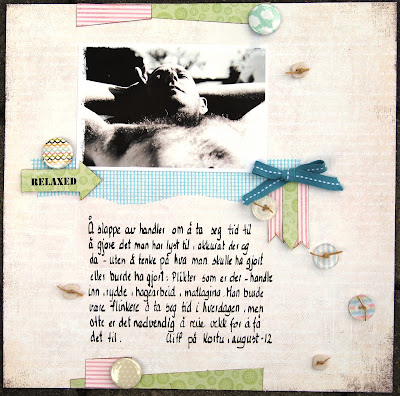
Soft colors and a hairy husband - the perfect combo! But one of the CSI challenges gave me the guts to try it out :-)

A happy kid need happy colors. My entry for a sketch challenge at Skissedilla


Black background makes bright colors pop. And I stamped on a layout! Yeah, me!
Made for a CSI/OUAS challenge


I love how light this layout is, despite the dark purple and green. Made for a CSI challenge.


Shabby chick, white space layout with a twist of artsy - it's possible :-)
GDT work for CSI
  Don't ask me if I can pick one fav, because I can't. Can you? And why did you pick that particular one?
Have you picked your own favs yet?


Tomorrow I'll give you my top ten fav cards/AI for 2012, so please come back!

lørdag 29. desember 2012

Feeding the wild birds - CSI #52

Hello friends.

I know it has been quiet on this blog in December, and I haven't been very active in cyber world either.
Do you want to know why? It's very simple - I have taken off anything scrappy to enjoy the season and to spend time with my family doing what we wanted to do when we were off. And it has been great, but I admit I'm itching to scrap and make cards again.

I also admit I have done some scrapping stuff behinds the scenes, like solving the CSI December challenges, and  working on a new personal blog. Yepp, I'm moving! My blog needs a makeover, and as the oldest posts are from 2008, so I thought I might as well create a completely new one.

So from January 1th 2013 you will find me at Hilde - The Paper Addict. I'm still working on the details, but the blog is open for you to have a sneek peek and to sign in as a follower. From mid January I will close the old Scoobie-blog for new comments, but the blog will still be there.


As you may have noticed I have been guest designing at CSI the entire month of December. I love the challenges and the color combos which forces me to try out new combinations, and I know I will continue to solve the cases in 2013.


Here is this week's case to be solved:


I just love the classy color combo!


And this is how I solved it:

Another layout where the materials are a true mix of different manufactorers. I THINK the background paper is MME, but isn't sure as the label was cut of, the alpha is from SEI,  the overlay from Hambley, but the rest I have no idea about.


How I solved the case:
  • Colors - all five used
  • Evidence: wood/woodgrain (Washer and baground paper), twine, kraft paper, burlap, eyelets, washer
  • Testimony: handwrited journaling, documenting a gift (figurative - we give something to the wild birds to during the season, not only the humans and domestic pets)

Don't you want to give this challenge a try? Here is where to find it!

søndag 23. desember 2012

Scoobie - 8

I can't believe my puppy is eight years old - I still remember so well when we drove and picked her up.
Scoobie is born on december 24th, so her breeder name is, not surprisingly, Timanka's Christmas Wonder.

She still has the puppy in her, and she is the most happy, loving dog there is. Here she is:

Papers: Tilda
 Some close up photos:


This layout is my example for the CSI File Case # 51:


Evidence: Metal, filigree, rhinestone/pearls
Testimony: six word memoir

Don't you love this week's colors and challenges?

onsdag 19. desember 2012

Stickles is a girl's best friend (cards)!

I was good and sat down last weekend to write the last Chistmas greetings, but I ran out of cards! Bummer, I thought I had made plenty.

So a girl got to do what a girl got to do: whip up some last minute Christmas cards.
In early december I needed to stock up some papers with pink in, as I had ran completely out, and I bough a super cute collection from Panduro/Tilda, called Christmas Play. My original intention was to use it for non seasonal stuff, but as it had some lovely themed cut outs, I thought I could use it for seasonal cards as well.


These cards are far out from my traditional style, but I enjoyed making them, and they were rater quick to make.


So where do the Stickles come in?
When I had put these cards together, I thought they missed the little extra. So I pulled out the good old Stickles and some Glossy and added on my cards to make them a little more festive and to add smore dimension.


Volia! Not so dull cards anymore.
It might be difficult to see the stickles and the glossy on these lousy images, but believe me, it's there :-)


What do you use to make your cards pop?

mandag 17. desember 2012

Celebrating Saint Lucy's Day

... or Saint Lucia's Day as we say in Norway.

From Wikipedia: "For the traditional observance of the day, school children form processions through the hallways of the school building carrying candles, and hand out lussekatt buns. While rarely observed at home, parents often take time off work to watch these school processions in the morning, and if their child should be chosen Lucia it is considered a great honor. Later on in the day, the procession usually visits local retirement homes, hospitals, and nursing homes"
You can read more about this tradition here.


All manufactorers unknown - this a true mix of stuff found in my scrap boxes :-)

Saint Lucy's Day is on December 13th. In our school, it is the fourth graders who do the processions, and last year it was my youngest son's turn.


    As you may know I'm guest designing for CSI this monthe, and this is my example for CSI Case #50  The color combo in this challenge was just perfect for my photos and the theme and it was great to finally have them scrapped!   CSI Case File # 50:  
Colors: OK Evidence: Ribbon, wood, shimmery/shiny items Testimony: Documenting holiday tradition     Do you celebrate Saint Lucy?